桌面到口袋
Evid.AI 是论界(Schola)的移动端形态,与桌面端共用同一个医学证据底座:PubMed 约 3800 万篇文献、4 万份循证指南、50 万条临床试验注册记录、2 万多份药品说明书,每条结论都强制附带可跳回原文的引用。两端的差别不在能力,而在使用姿势——桌面端服务「坐下来写」,检索、精读、综述、沉淀摊开在一屏;移动端服务「站着问」,场景是查房、会诊、门诊间隙和值班的夜里,医生常常只有一只手和几十秒。所以这一版没有把工作台缩小,而是把整条链路压成一次对话:说清问题、拿到结构化结论、继续追问、导出带走。
Evid.AI is the mobile form of Schola and shares one medical evidence base with the desktop product: roughly 38 million PubMed articles, 40 thousand evidence-based guidelines, 500 thousand clinical trial records and more than 20 thousand drug labels, with every conclusion required to carry a citation that jumps back to the source. The two ends differ not in capability but in posture — the desktop serves writing at a desk, with search, close reading, review and archiving spread across one screen, while mobile serves asking on the move: ward rounds, consultations, gaps between clinics and night shifts, when a doctor has one hand and a few dozen seconds. So this version did not shrink the workstation; it compressed the whole chain into a single conversation — state the question, get a structured answer, keep asking, export and take it away.
| 场景 | 用户 | 价值 |
|---|---|---|
| 查房与会诊时的即时查证、门诊间隙的用药核对、夜班疑难病例的快速定位、病例讨论前的证据准备、向患者解释病情时的通俗转述 | 临床医生(住院 / 主治)、规培与进修医生、医学生、基层全科医生、药企医学顾问 | 单手就能提问、分钟级拿到带引用的结论、结论可回溯原文、对话可存档续问、与桌面端共享同一证据底座 |

品牌语言
桌面端是深蓝的学术调,直接搬到手机上会显得沉闷,所以这一版单独起了一套更轻的语言:渐变光环包住字标、暖色到冷色在环上过渡、背景换成大面积柔光云纹,亮度整体抬高。环的形状没有丢,它仍是「证据围成闭环」的同一隐喻;「Ä」上方的星形负责点亮,让品牌在 32px 的小图标里也能被认出来。
The desktop visual is a deep-blue academic tone that would feel heavy on a phone, so this version gets its own lighter language: a gradient ring around the wordmark shifting from warm to cool, a large soft cloud backdrop and an overall lift in brightness. The ring stays — the same metaphor of evidence closing a loop, so the two ends connect semantically — and the star above the Ä does the lighting work, keeping the brand readable inside a 32px icon.
一步进入
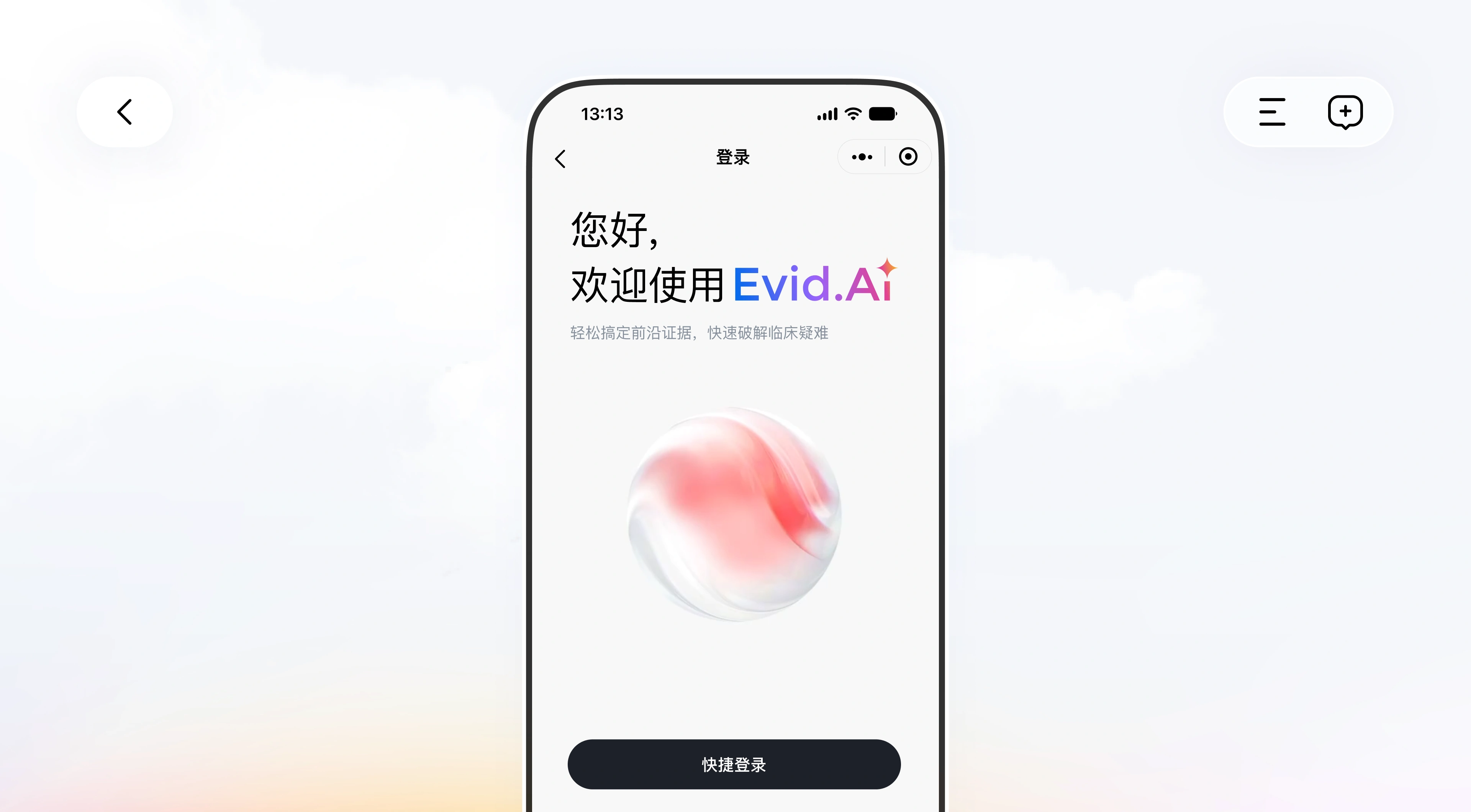
首屏只回答两件事:你是谁,我为什么信你。用「您好,欢迎使用 Evid.AI」做称呼,价值主张压成一句「轻松搞定前沿证据,快速破解临床疑难」,中间一颗缓慢呼吸的 3D 球体把视线引到底部。整屏只有一个可操作项——通栏的「快捷登录」,不设账号密码:手机上敲长密码成本太高,交给系统快捷方式更快也更少出错。
The first screen answers two things: who you are, and why I should trust you. A greeting introduces the product, the value proposition is compressed into one line, and a slowly breathing 3D sphere pulls the eye down to the button. Only one action exists — a full-width quick sign-in, with no password field, because typing a long password on a phone is costly while system-level shortcuts are faster and less error-prone.
问题模板
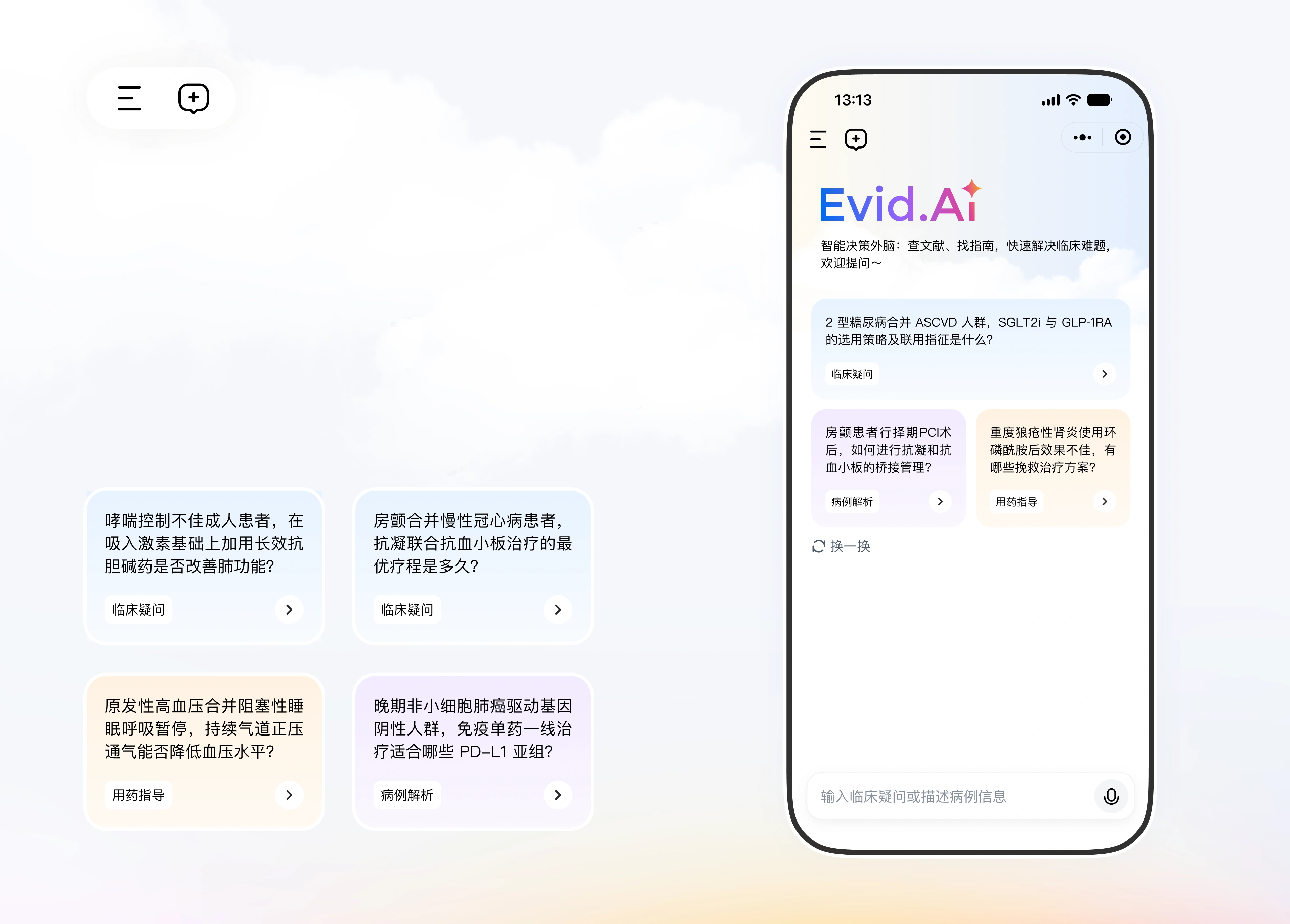
空输入框是最差的新手引导。首页直接给出四张真实临床问题卡片,卡片底部用颜色标注任务类型:临床疑问是蓝、病例解析是紫、用药指导是橙,点之前就知道这是在问哪一类事。右上角「换一换」可以无限刷新,把「不知道该问什么」直接消解掉。底部仍保留自然语言输入和麦克风:卡片给新手,输入框给熟手。
An empty input box is the worst onboarding. The home screen offers four realistic clinical questions as cards, each labelled by task type in colour — clinical question in blue, case analysis in purple, medication guidance in orange — so users know what kind of thing they are asking before they tap. A refresh link keeps the pool endless, dissolving the problem of not knowing what to ask. Natural-language input and a microphone stay at the bottom: cards for newcomers, the box for experienced users.
长文本编辑
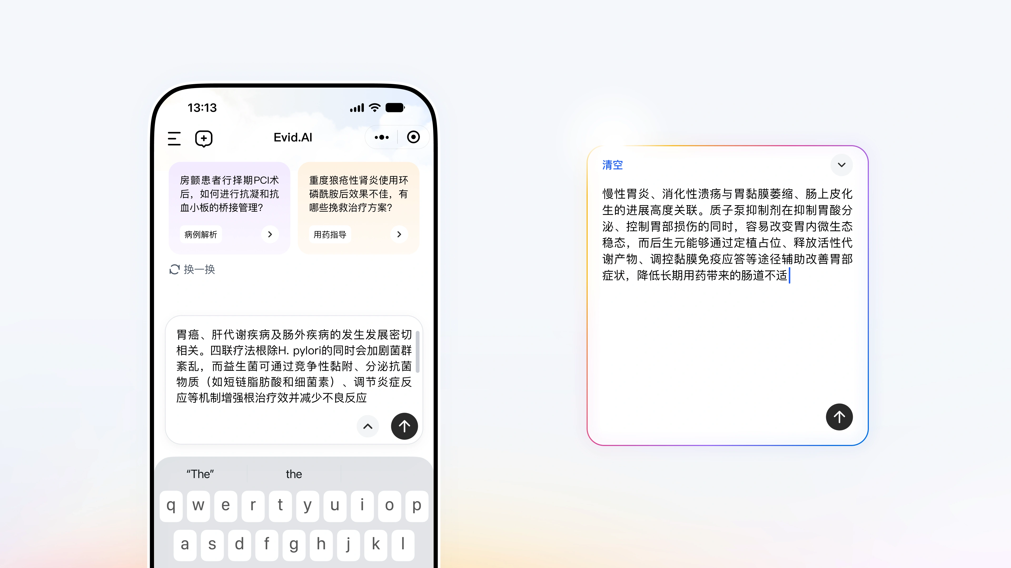
医生的提问往往是一整段病例,不是一句话。输入区因此做成可伸缩的编辑器:超过两三行自动上抬,弹开带渐变描边的圆角浮层,右上角箭头随时收起回看上下文;键盘弹起时输入区贴着键盘上沿,正在写的那几行不会被遮住。发送键用状态说话——空内容浅色不可点,有内容才变成实心深色。语音识别结果落进同一个编辑器,可以先改错字再发送。
A doctor's question is often a whole case, not a sentence. The input area is a stretchable editor: past two or three lines it lifts into a rounded panel with a gradient border, and a collapse arrow returns to the context; when the keyboard rises the editor sits on top of it, keeping the lines being written visible. The send button speaks through state — pale and disabled when empty, solid when filled. Speech results land in the same editor, editable before sending.
语音三态
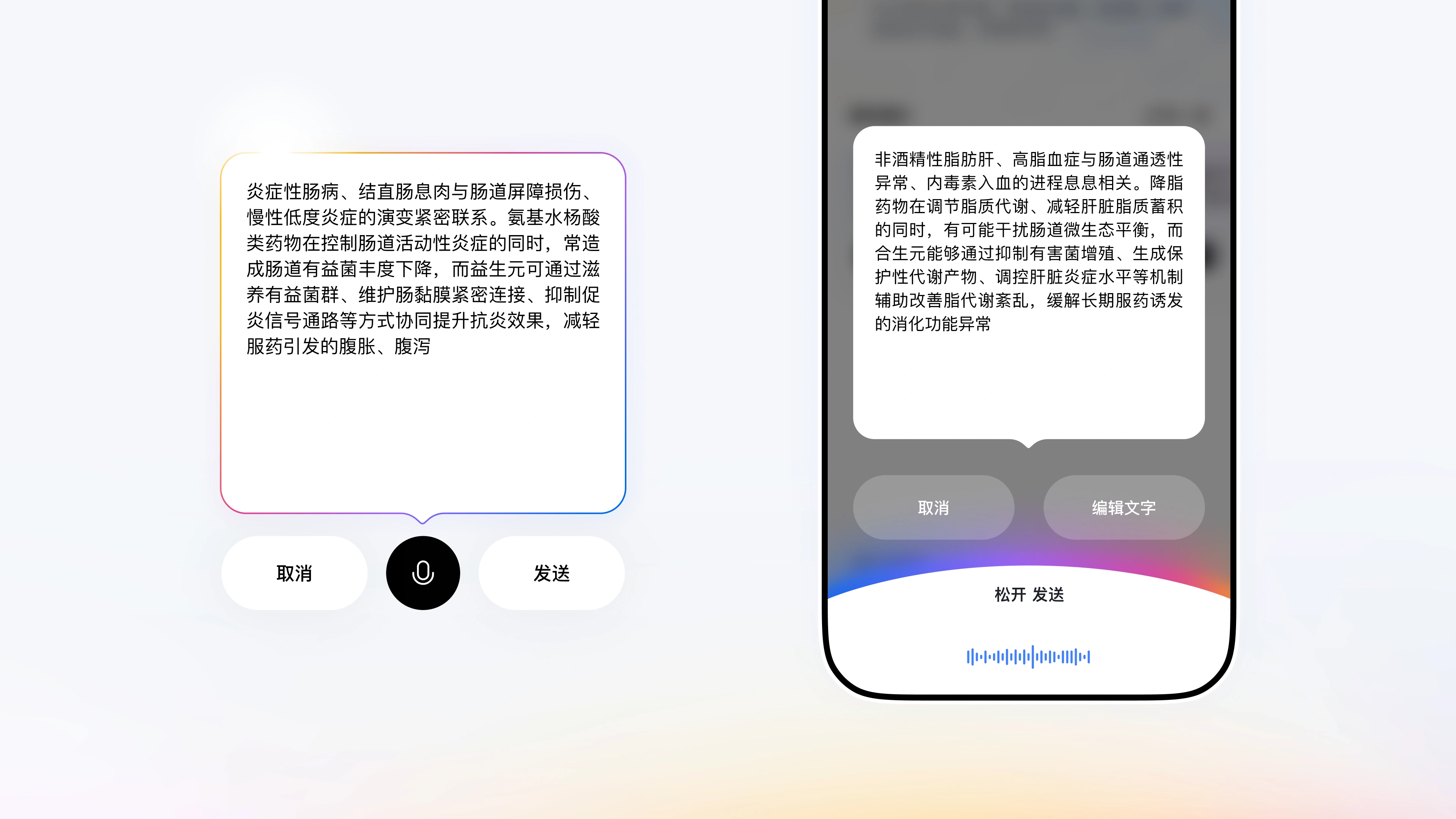
戴着手套、抱着病历、站在病房走廊上,打字是奢侈的,所以语音是这一版的主入口,被拆成三个可见状态:按住说话,底部浮出识别面板与实时波形,写着「松开 发送」;松开进入结果态,文字在渐变边框的卡片里,下面并排「取消 / 发送」,麦克风保留重录;识别有误点「编辑文字」逐字修正。三态共用一套粉色渐变,用户不必为语音再学一套界面。
With gloves on, records in one arm and a corridor to stand in, typing is a luxury — so voice is the main entry here, split into three visible states: hold to speak while a translucent panel and live waveform read release to send; release to see the transcript in a gradient-bordered card with cancel and send side by side, the microphone kept for re-recording; tap edit to correct the text character by character. All three share one pink gradient, so voice needs no separate interface language.
思考过程
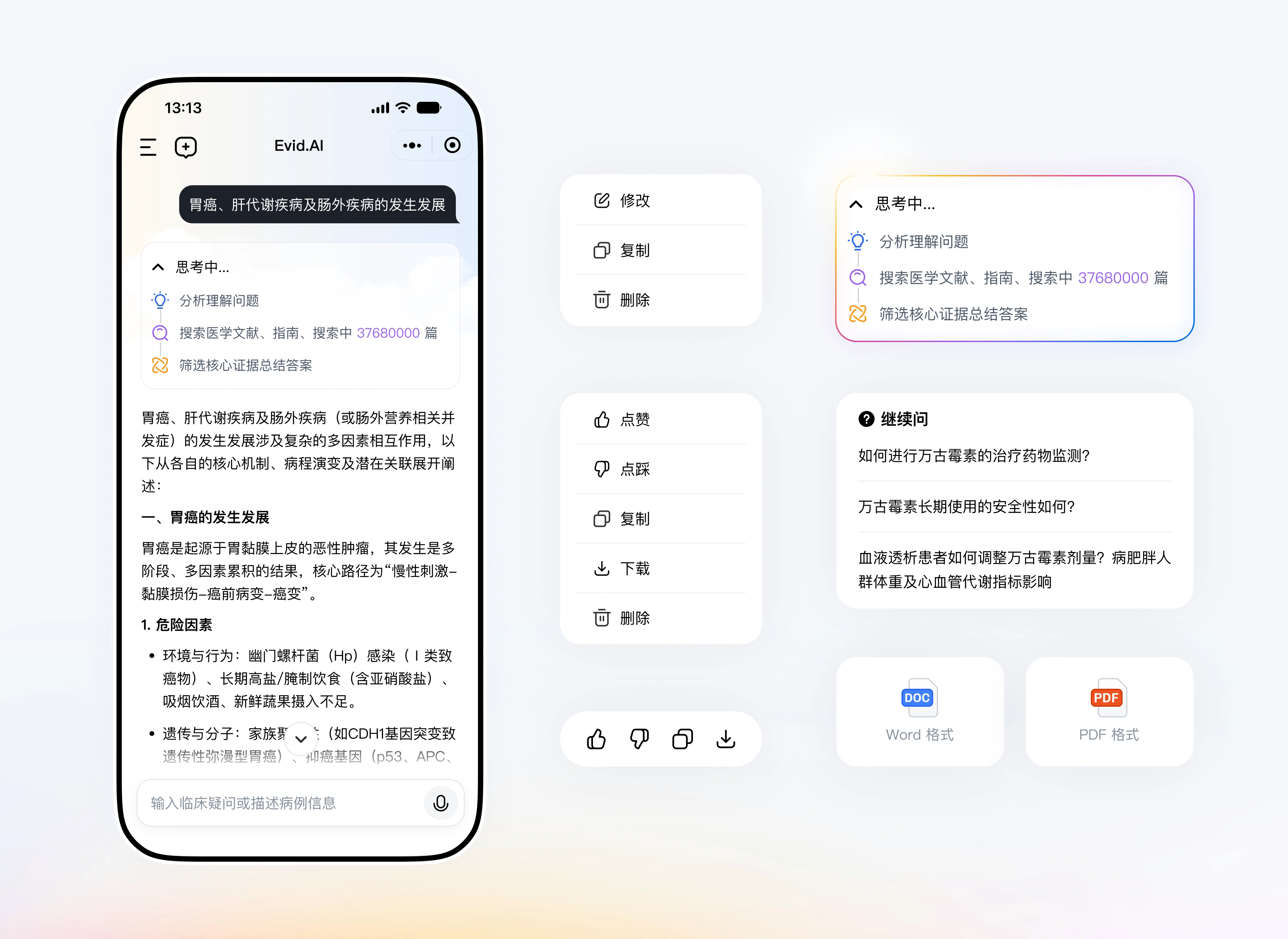
医疗 AI 最难的不是答得快,是让人敢用。所以系统先展开一段可折叠的「思考中」:理解问题、搜索文献与指南(实时显示「搜索中 37680000 篇」)、筛选核心证据总结答案,把黑箱变成可观察的过程。结论沿用学术写作的层级,关键机制都带着证据陈述;下方是点赞、点踩、复制、下载,「继续问」把一次问答延伸成追问链,确认有用后导出 Word 或 PDF。
The hard part of medical AI is not answering fast, it is earning trust. Instead of jumping to a conclusion, the system opens a collapsible thinking block: understand the question, search literature and guidelines (showing a live count of 37,680,000), filter the core evidence and summarize — turning a black box into something observable. The answer keeps an academic hierarchy with every mechanism tied to evidence statements, followed by like, dislike, copy and download, and a follow-up entry that turns one answer into a chain, exportable to Word or PDF.
会话即病例
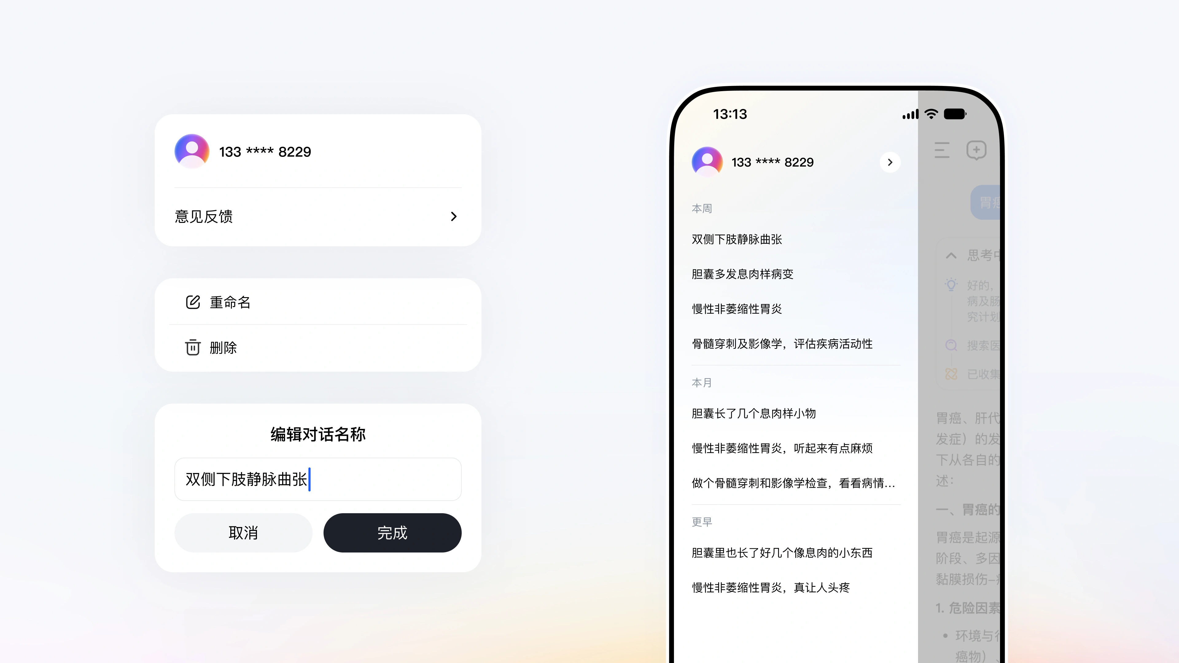
一个夜班可能开十几个对话。列表按「本周 / 本月 / 更早」分组,标题不用系统摘要,而用医生当时的原话——「胆囊里也长了好几个像息肉的小东西」,比「胆囊息肉诊断分析」更容易被本人一眼认出。单条会话支持重命名和删除,重命名弹窗预填原文、光标停在末尾;顶部账号区把手机号脱敏成「133 **** 8229」,把隐私放在最显眼的位置。
A night shift can start a dozen conversations. History groups them by this week, this month and earlier, and titles come from what the doctor actually said — such as a few polyp-like things in the gallbladder too — which is far easier to recognise than a system-written summary. Each item can be renamed or deleted, with the dialog prefilled and the cursor at the end, while the account area masks the phone number as 133 **** 8229, putting privacy where it is most visible.
引用的数据
| 38MPubMed 全库文献 | 40K循证医学指南 | 500K+临床试验注册记录 |
| 20K+药品说明书 | ≤50单次检索结果上限(篇) | 24h文献与指南自动更新 |