配置到履约
这是一个面向医疗健康业务的商城管理后台,服务于店铺、商品和订单三类核心业务。运营团队在后台创建并配置商品,管理图片、介绍、价格、类型与分佣规则,再发布到移动端和 C 端售卖。项目要解决的,是把复杂的商品运营流程整理成清晰、可控、可复用的工作流——从店铺管理到商品创建、从商品发布到订单处理、从发货到售后,每一环都能被找到、被看懂、被追踪。设计上把业务规则、状态反馈和关键操作前置,降低后台操作成本与误操作风险,为医疗健康产品线提供稳定的交易与运营基础。
This is a commerce management backend for healthcare businesses, built around three core areas: stores, products and orders. Operations teams create and configure products — imagery, descriptions, pricing, product types and commission rules — then publish them for sale on mobile and consumer-facing channels. The project turns a complex merchandising workflow into one that is clear, controllable and reusable: from store management to product creation, from publishing to order handling, from shipping to after-sales, every step can be found, understood and tracked. Business rules, status feedback and critical actions are brought forward to cut operating cost and the risk of misoperation, giving healthcare product lines a stable foundation for transactions and operations.
| 业务目标 | 核心功能 | 设计价值 |
|---|---|---|
| 支持医疗健康商品的店铺管理、商品配置、发布售卖和订单履约 | 店铺管理掌握经营概况;商品管理完成配置与发布;订单管理跟进交易与履约 | 从零搭建统一的后台设计语言,降低商品运营与订单处理的复杂度,提升交付效率与购买体验 |
登录授权
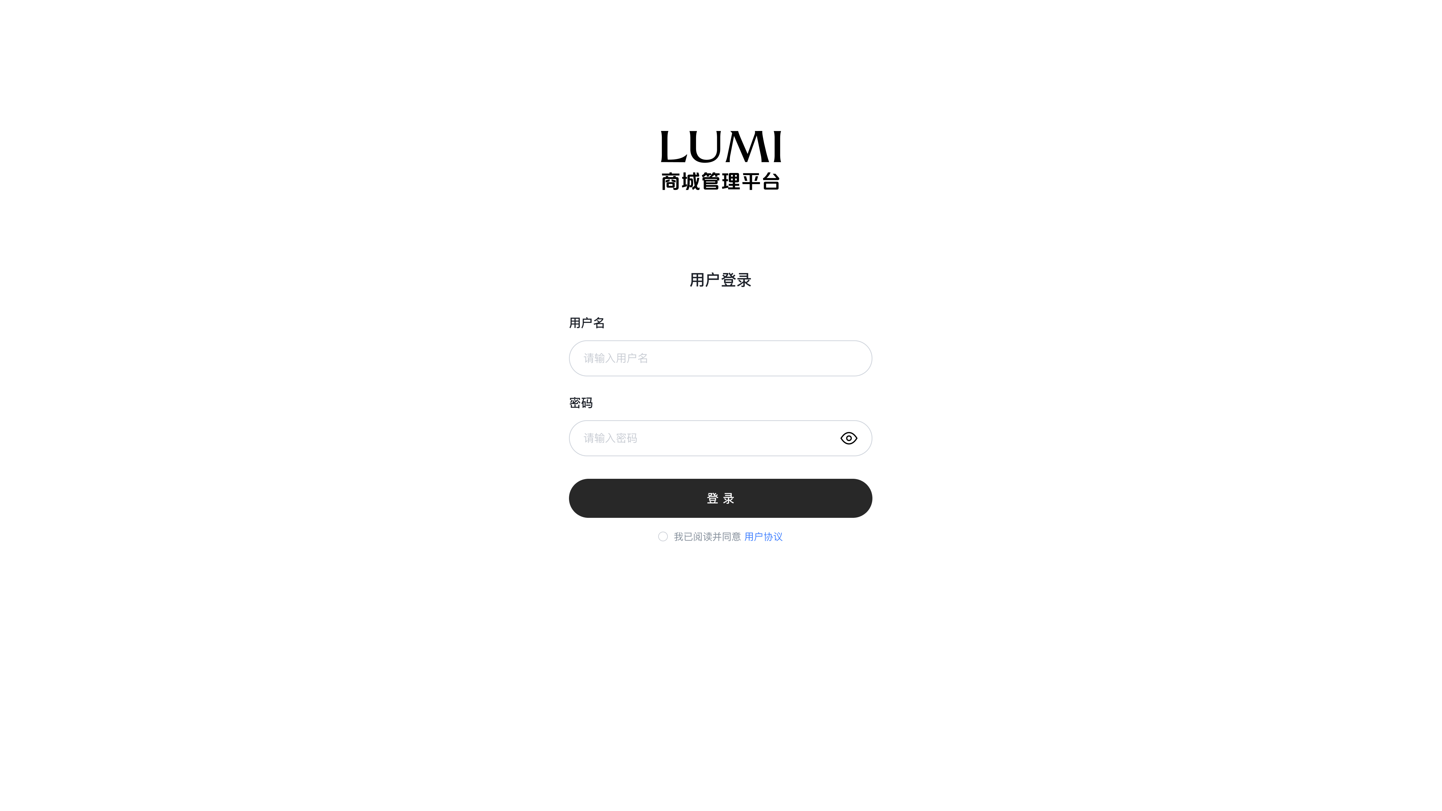
登录页把品牌与表单分开:上方 LUMI 标识说明这是什么系统,下方白色卡片只承载用户名、密码和协议确认三件事,让视线自然落到唯一的黑色主按钮上。密码框内嵌「显示密码」的切换,减少输错重试;协议勾选前置到提交之前,是合规要求,也是使用者在第一步就被明确告知数据与条款边界的地方——后台的信任,从登录这一屏开始建立。
The login page separates branding from the form: the LUMI mark on top tells you what system this is, while the white card below carries only three things — username, password and agreement consent — leading the eye to the single black primary button. A password visibility toggle inside the field cuts down retries after typos, and placing the agreement before submission is both a compliance requirement and the moment users are told up front where the boundaries of data and terms lie — trust in a backend starts on this screen.
店铺管理
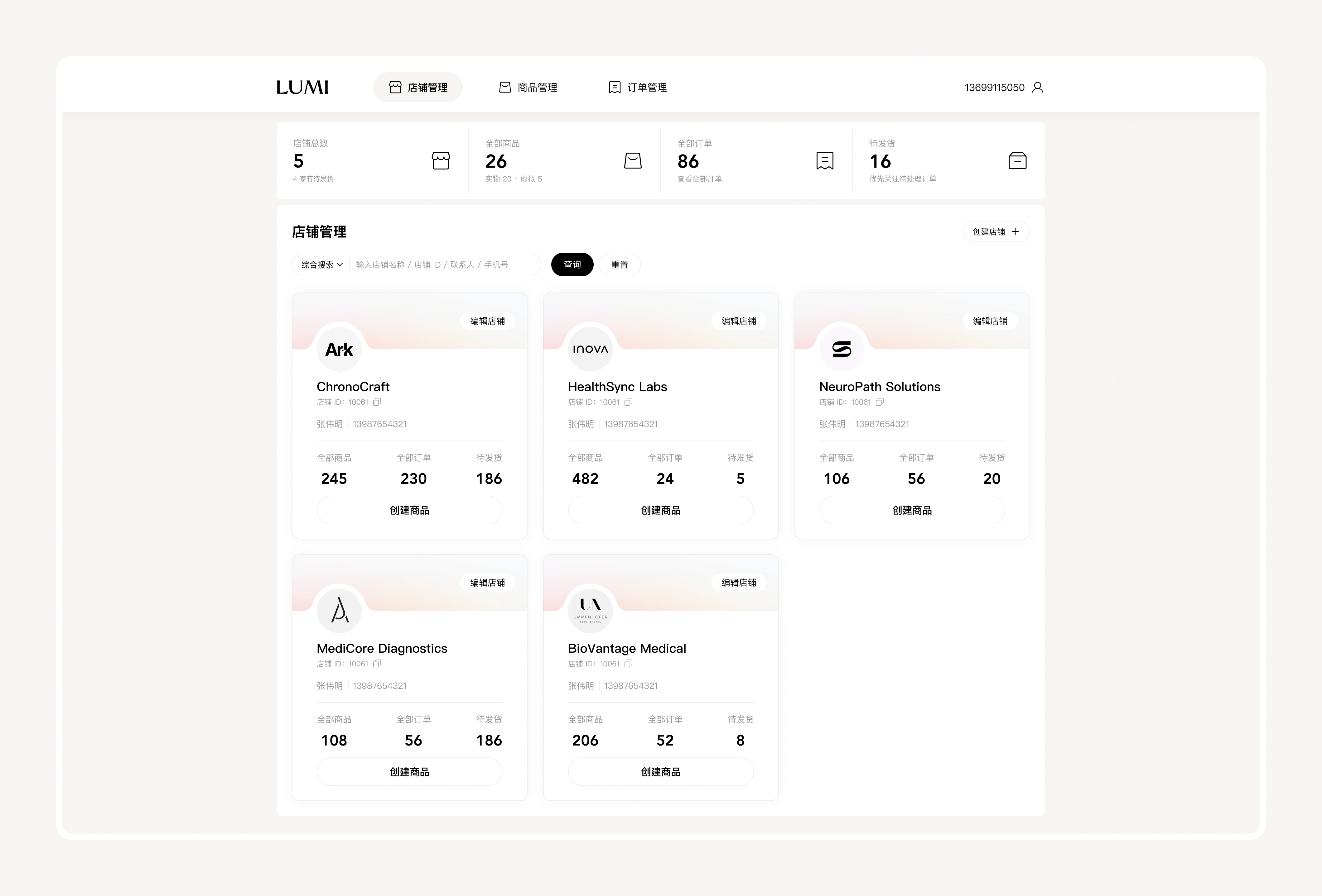
顶部四个指标卡把店铺总数、全部商品、全部订单与待发货量一次摊开,运营进后台的第一眼就知道今天要处理什么。店铺不用表格而用卡片承载:每张卡都有店铺 ID、联系人、商品/订单/待发货三个关键数字,以及「创建商品」快捷入口——把「看全局」和「干活」放在同一张卡上,减少来回跳转。右上「创建店铺」是全局唯一入口,卡片右上角的「编辑店铺」在悬停时浮出,日常操作不占用阅读时的注意力。
Four indicator cards lay out total stores, all products, all orders and pending shipments at once, so operators know what to deal with today the moment they land. Stores are shown as cards rather than a table: each carries the store ID, contact, three key numbers for products, orders and pending shipments, plus a quick "create product" entry — putting overview and action on the same card and cutting back-and-forth navigation. "Create store" in the top right is the single global entry, while "edit store" surfaces on hover so routine actions do not compete for attention while reading.
商品创建
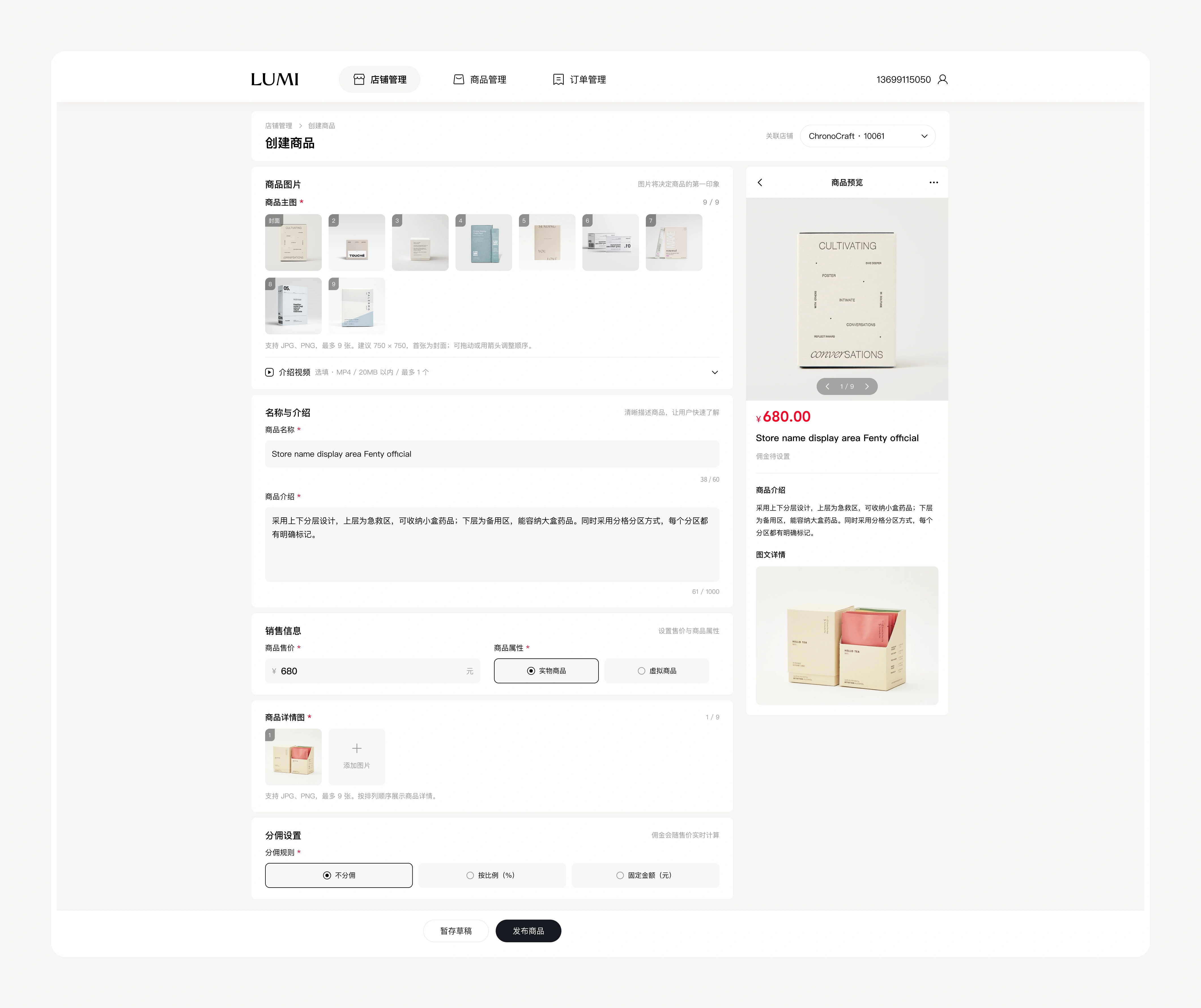
创建商品是后台最重的一步,页面用「左侧表单 + 右侧实时预览」的双栏结构,让填写和查看同步发生。表单按商品图片、介绍视频、名称与介绍、销售信息、详情图、分佣设置分组,必填项带星号,字数与尺寸限制贴着输入框提示;实物商品与虚拟商品的属性选择直接决定后续流程。底部「存草稿」与「发布商品」并列,长表单可以分次录入,不会因为中途离开而丢掉已填内容。
Creating a product is the heaviest step in the backend, so the page uses a two-column layout — form on the left, live preview on the right — where filling and checking happen together. The form is grouped into imagery, intro video, name and description, sales information, detail images and commission settings, with required fields starred and length or size limits noted right beside the inputs; choosing physical or virtual product determines the flow that follows. "Save draft" sits next to "publish" so long forms can be filled in stages without losing work.
商品管理
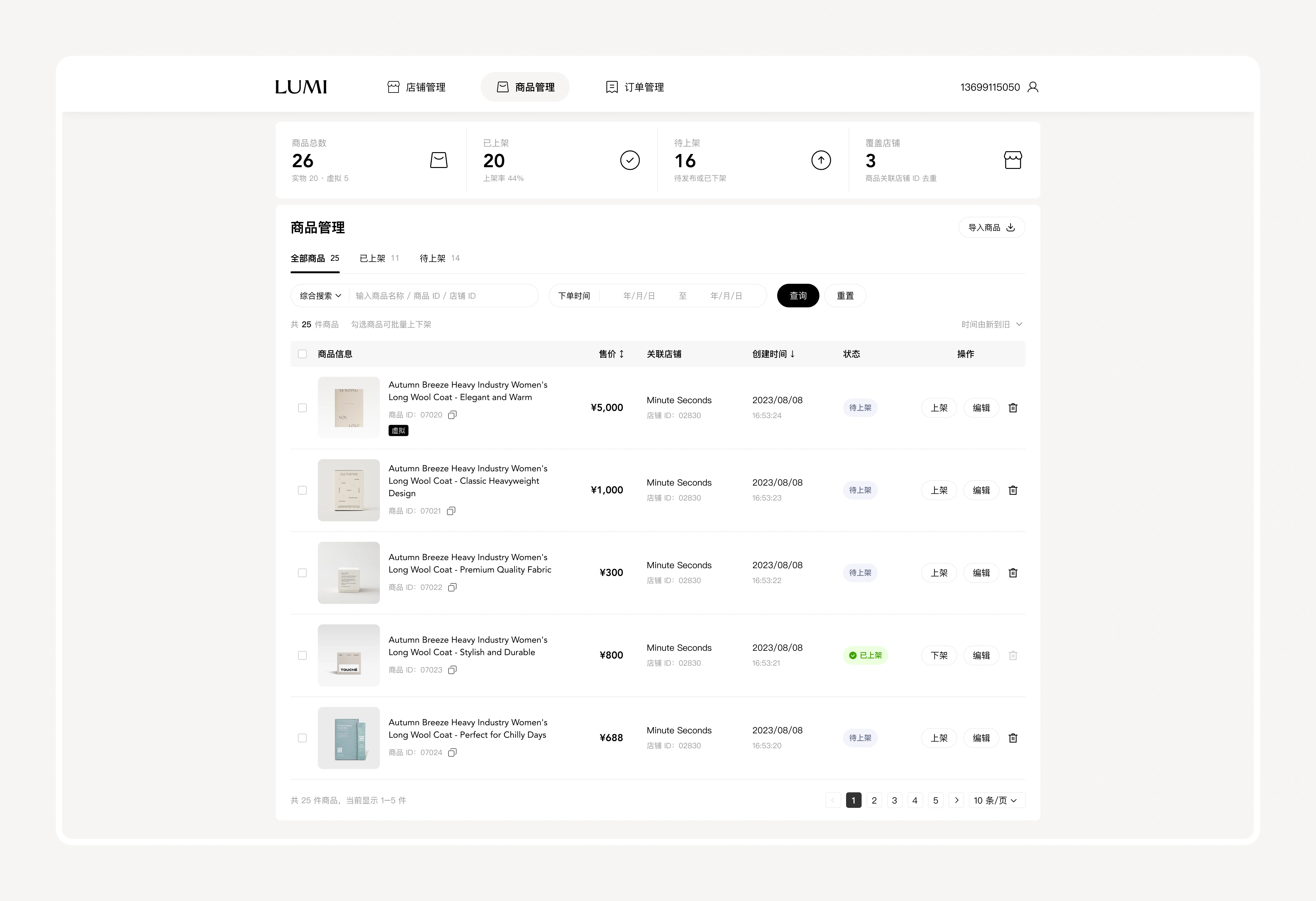
商品列表把「找得到」和「批量处理」当成两个设计目标。顶部指标卡区分商品总数、已上架、待上架与覆盖店铺,配合「全部/已上架/待上架」三个状态 tab,运营可以先按状态切分再检索;搜索支持商品名称、商品 ID、店铺 ID,与下单时间筛选、重置、导出并排在同一行,筛完就能直接拿到结果。表格把商品图、名称、售价、关联店铺、创建时间、状态与操作收在一条信息带里,上架/下架、编辑、删除以轻量按钮承载,勾选后可批量上下架。
The product list treats "findable" and "bulk action" as two design goals. Indicator cards split total products, published, unpublished and covered stores, and three status tabs — all, published, unpublished — let operators narrow by state before searching; search supports product name, product ID and store ID, sitting on one line with date filtering, reset and export so results come back immediately. The table packs product image, name, price, store, creation time, status and actions into one band, with publish, unpublish, edit and delete as lightweight buttons, and bulk publishing after selection.
订单管理
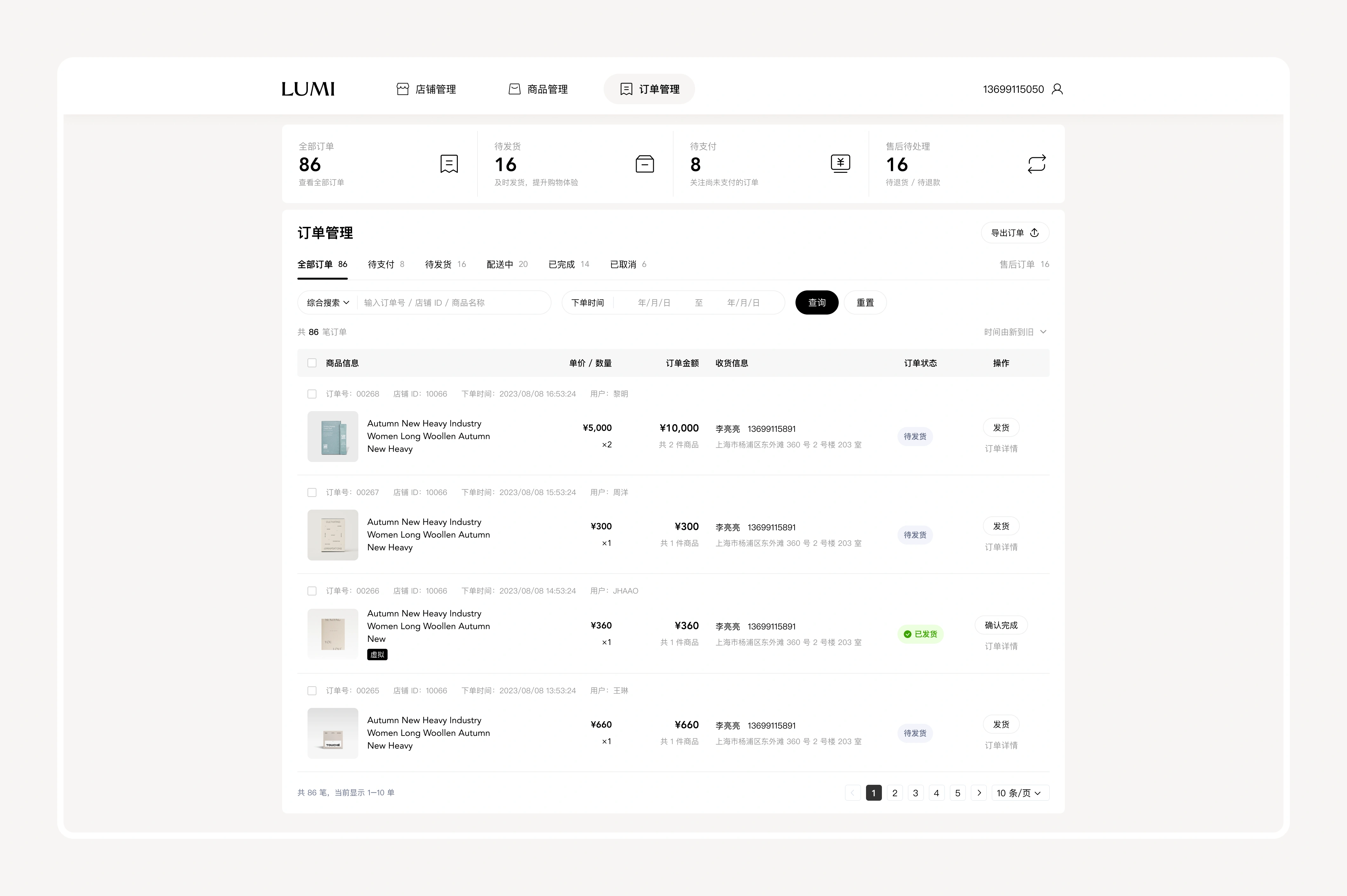
订单页按交易状态组织信息:全部、待支付、待发货、配送中、已完成、已取消,外加独立的售后入口,让运营顺着「钱走到哪一步」来认领任务。顶部指标卡把全部订单、待发货、待支付、售后待处理提前到首屏,形成当天的处理优先级;每条订单同时给出商品信息、单价数量、订单金额、收货信息与状态,发货、确认完成、订单详情三个动作直接落在行内,不进详情页也能把一单履约推进下去。
The order page organizes information by transaction state: all, pending payment, pending shipment, in transit, completed and cancelled, plus a separate after-sales entry, so operators claim tasks by tracking how far the money has moved. Indicator cards lift all orders, pending shipment, pending payment and after-sales to the top as the day's priority; each order shows product, unit price and quantity, order amount, shipping details and status, with ship, confirm completion and details acting inline so a fulfillment can be pushed forward without opening the detail view.
订单详情
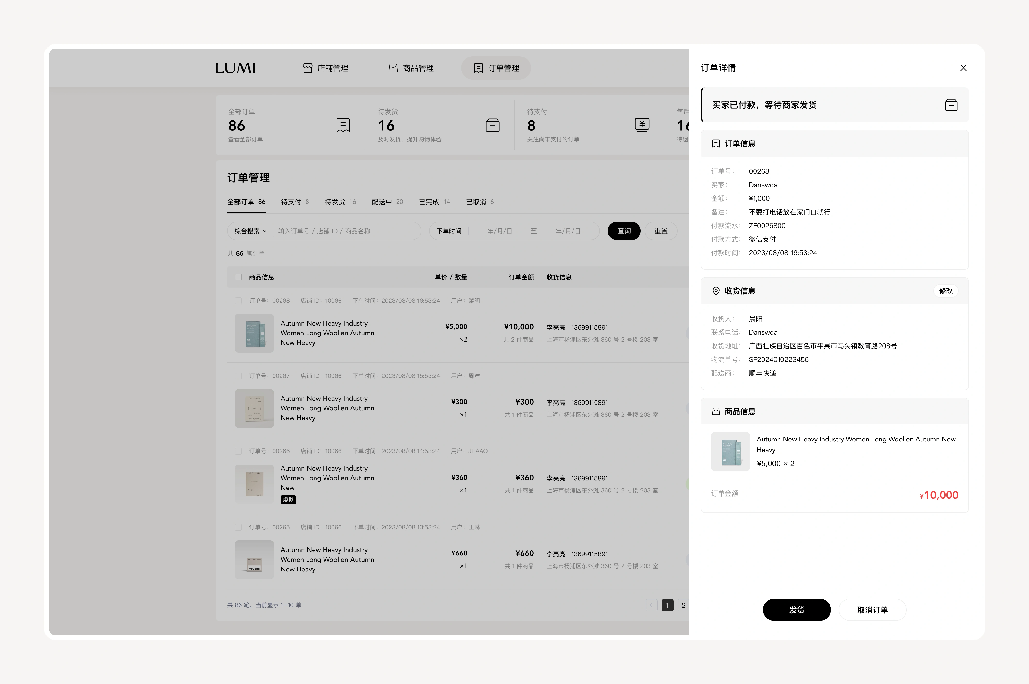
详情用右侧抽屉叠在列表之上,而不是跳转到新页面——运营处理完一单可以立刻回到原位置,筛选条件和页码都还在,这是高频核对场景里最实际的效率设计。抽屉顶部用一句话给出当前状态,往下依次是订单信息、收货信息、商品信息:订单号、付款流水、付款方式保证交易可追溯,收货信息可以修改以应对地址变更,底部固定「发货」与「取消订单」,把关键动作钉在视线终点。
Details open as a drawer over the list rather than a new page, so an order can be handled and the operator returns to the same spot with filters and page number intact — the most practical efficiency gain in a high-frequency checking scenario. A single sentence at the top states the current status, followed by order information, shipping information and product information: order number, payment reference and payment method keep the transaction traceable, shipping details can be edited when an address changes, and "ship" and "cancel order" are pinned at the bottom as the endpoint of the eye.
操作反馈
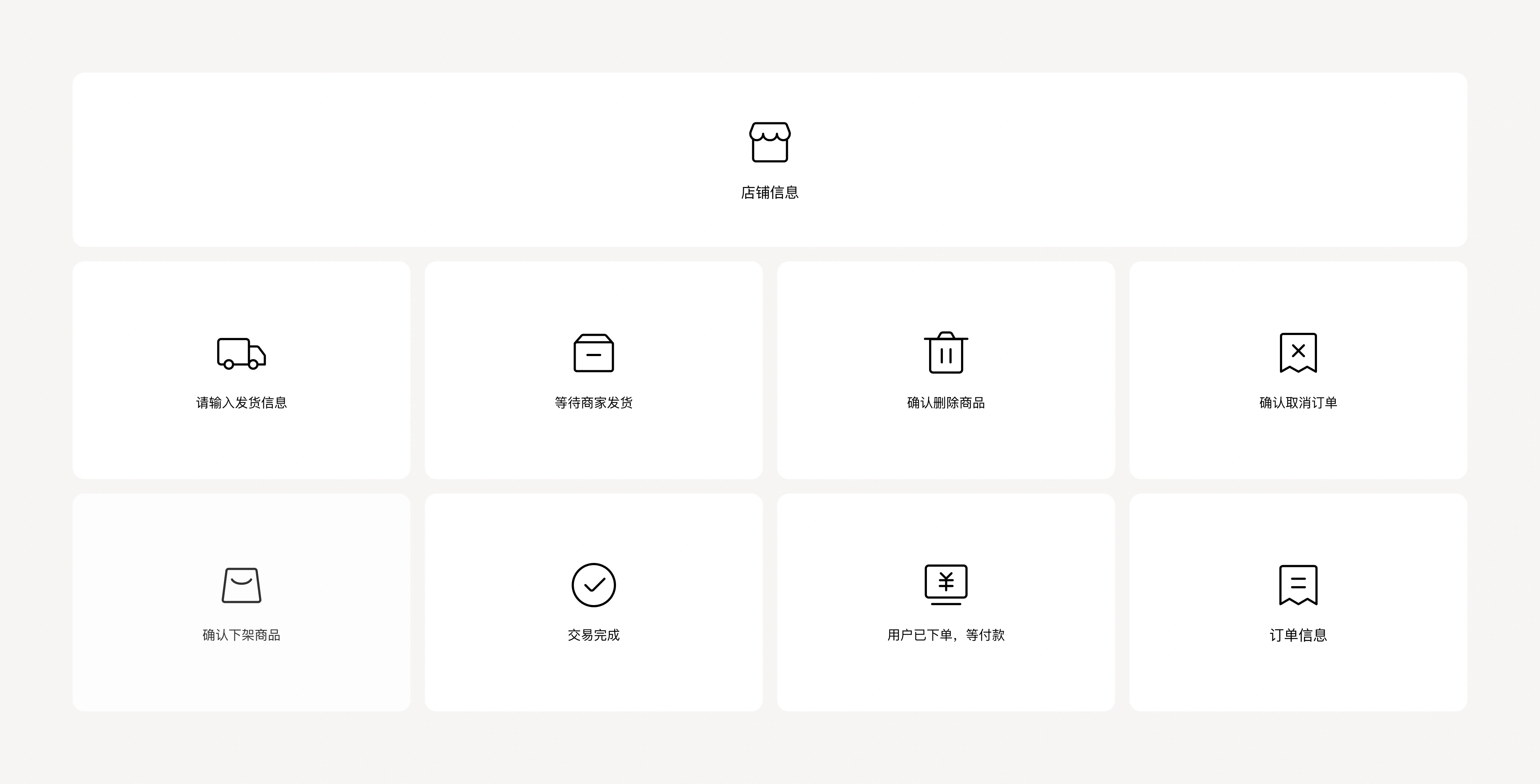
发货、下架、删除、取消订单这些动作都不可逆,页面因此把「确认」做成一套统一组件:图标、标题、说明与按钮位置保持一致,让用户在不同模块里看到的是同一套语言。空态与状态提示也沿用同一套线条图形——等待商家发货、交易完成、用户已下单等付款,用同一种表达说清不同阶段,既降低学习成本,也让风险操作在最后一刻被看清。
Shipping, unpublishing, deletion and cancellation cannot be undone, so confirmation is built as one consistent component: icon, title, description and button placement stay the same, and users meet the same language across modules. Empty states and status prompts reuse the same line-icon set — waiting for shipment, transaction complete, order placed and awaiting payment — expressing different stages in one visual language that lowers learning cost and makes risky actions clear at the final moment.
设计原则
| 规则前置必填项、字数与尺寸限制贴着输入框提示 | 状态可见用状态 tab 与指标卡把待办提前到首屏 | 动作收敛不可逆操作统一确认组件,关键按钮位置固定 |